Wide 'responsive' image
[ 14/08/24 onwards, updated 15/08/24 ]

Sofia
The width of the 1200 pixel wide image is 'physically' limited to 1200 pixels with style="max-width: 1200px;" (optional).
The HTML markup:
<div class="max">

<img src="img/sofia-1200.jpg" width="1200" height="628" style="max-width: 1200px;" alt="">

</div>
Inline option: <div class="max" style="background-color: none;">
Full width image
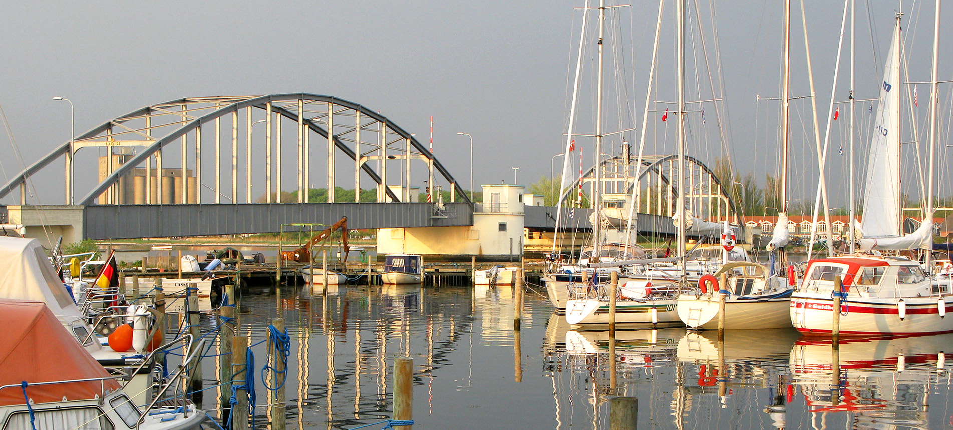
Guldborg Marina, Denmark
Photo by Patrick Taylor
The photo above has no 'max-width' so fills the screen horizontally regardless of its width. It is over twice as wide as high (in pixels) so that while it fills the screen horizontally, the full height of the photo should still be visible without too much vertical scrolling.
Full width image gallery
With a bit of extra css, <div class="max"> can also be used to make a (more or less) full width image gallery:

The HTML markup:
<div class="max" style="background-color: #fff;">

<div class="flexcontainer row" style="max-width: 92%; padding: 30px; column-gap: 27px;">

<div class="flexitem">
<div><a href="./image-page"><img src="img/thumbnail-image1.jpg" width="160" height="160" alt=""></a></div>
</div>

more flexitems ...

</div><!-- end flexcontainer //-->
Note: in the default styles, 'flexitems' are 160 pixels square with thumbnail images 160 pixels square, so you will need to make a thumbnail image to link to each image page.